 Investing is often seen as complicated. And this has been made worse over the years by the increasing complexity in terms of investment products and choices, regulations and rules around investing, the role of the information revolution and social media in amplifying the noise around investment markets and the expanding ways available to access various investments. But at its core, the basic principles of successful investing are simple. And one way to demonstrate that is in charts or pictures – after all, a picture tells a thousand words. So this note looks at five charts I find useful in understanding investing. I’ll put out part 2 – another five great charts on investing – in a few weeks’ time.
Chart 1: The power of compund interest
This chart is my absolute favourite. My good friend, the well-known economist Dr Don Stammer, has said there are six things we owe our children or grandchildren: a sense of humour; a reasonable education; an early understanding of the magic of compounding; an awareness the cycle lives on; some help when they buy their first house or apartment; and a feeling of optimism. I can’t argue with the first, second and fifth, the fourth I will deal with next, and a feeling of optimism is essential if you wish to succeed as an investor. But on compound interest – he’s right it is like magic!
Source: Global Financial Data, AMP Capital
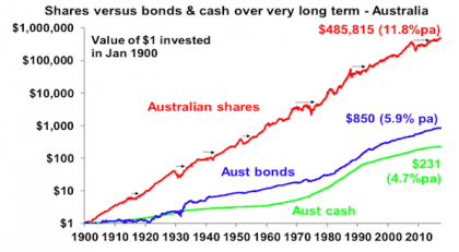
The chart shows the value of $1 invested in various Australian assets in 1900 allowing for the reinvestment of dividends and interest along the way. That $1 would have grown to $231 if invested in cash, to $850 if invested in bonds and to $485,815 if invested in shares. While the average return since 1900 is only double that in shares relative to bonds, the huge difference between the two at the end owes to the impact of compounding or earning returns on top of returns. So any interest or return earned in one period is added to the original investment so that it all earns a return in the next period. And so on.
The “Law of 72” is a useful tool to understanding how long it takes an investment to double in value using compounding. Just divide the rate of return into 72 and that’s the answer (roughly). For example, if the rate of return is 2% per annum (eg, the interest rate on a bank term deposit), it will take 36 years to double in value (= 72 divided by 2). But if it’s, say, 8% pa (eg, the expected total return from shares including dividends), then it will take just 9 years (= 72 divided by 8). Key message: if we want to grow our wealth, we must have exposure to growth assets like shares and property.
Chart 2: The cycle
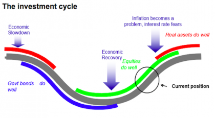
But of course shares can have lots of setbacks along the way as is particularly evident during the periods highlighted by the arrows on the share market line. In fact, the higher returns shares generate over time relative to cash and bonds is compensation for the periodic setbacks that they suffer from. But understanding those periodic setbacks – that there will always be a cycle – is important in not getting blown away from the higher returns that shares and other growth assets provide over time. The next chart shows a stylised version of the investment cycle.
Source: AMP Capital
The grey line shows the economic cycle from “boom” to “bust” to “boom” again. Prior to the low point in the economic cycle, shares invariably find a bottom thanks to attractive valuations and easy monetary policy and as smart investors look forward to an eventual economic recovery. This phase is usually characterised by scepticism as economic conditions are yet to improve. Shares then move higher, eventually supported by stronger earnings on the back of improving economic conditions, which eventually gives way to a blow off phase or euphoria as investors pile in. This is ultimately brought to an end as rising inflation flowing from strong economic conditions results in ever-tightening monetary policy, which combines with smart investors anticipating an economic downturn and results in shares coming under pressure. Usually around the top of the cycle real assets – like property and infrastructure – are a better bet than shares as they benefit from strong real economic conditions. But once the downturn hits bonds are the place to be as slowing growth eventually gives way to falling inflation allof which sees bond yields decline producing capital gains for investors. At some point, of course, easing monetary conditions and attractive valuations see shares bottom out and the whole cycle repeats.
Key message: cycles are a fact of life and while they don’t repeat precisely, it’s invariably the case that the share market leads the economic cycle (bottoming out before economic recovery is clear and topping out before an economic downturn has really hit) and that different assets perform relatively best at different phases in the cycle.
Chart 3: The roller coaster of investor emotion
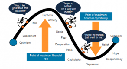
The swings we see in investment markets are far greater than can be justified by movements in investment fundamentals alone – ie profits, dividends, rents, interest rates, etc. In fact, investor emotion plays a huge part. The next chart shows the roller coaster that investor emotion traces through the course of an investment cycle. A bull market runs through optimism, excitement, thrill and ultimately euphoria by which point the asset class is over loved (and usually overvalued too) – everyone who is going to buy has – and it becomes vulnerable to bad news. This is the point of maximum risk. Once the cycle starts to turn down in a bear market, euphoria gives way to anxiety, denial, fear, capitulation and ultimately depression at which point the asset class is under loved (and usually undervalued) – everyone who is going to sell has – and it becomes vulnerable to good (or less bad) news. This is the point of maximum opportunity. Once the cycle turns up again, depression gives way to hope, relief and optimism before eventually moving on to euphoria again.
The roller coaster of investor emotion
Source: Russell Investments, AMP Capital
Key message: investor emotion plays a huge roll in exaggerating the investment cycle. The key for investors is not to get sucked into this emotional roller coaster: avoid assets where the crowd is euphoric and convinced it’s a sure thing and the asset is over loved, and favour assets where the crowd is depressed and the asset is under loved.
Chart 4: The wall of worry
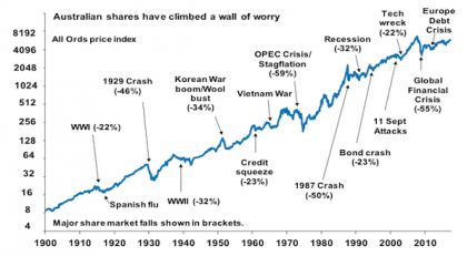
It seems that these days there is always something for investors to worry about. This year so far has been no exception with numerous worries about President Trump on multiple fronts (will he overstimulate the US economy? will he cause trade wars? will he deliver on his pro-business policies? will he be impeached? etc), various terrorist attacks, elections in the Netherlands and France and worries about Italy, the surprise election result in the UK, tensions between Saudi Arabia and Qatar, a new plunge in the oil price, intensifying “provocations” from North Korea, ongoing worries about the Australian property market and banks, etc. But most of this stuff is just noise. The global economy has had plenty of worries over the last century, but it got over them with Australian shares returning 11.8% per annum since 1900, with a broad rising trend in the All Ords price index as can be seen in the next chart, and US shares returning 9.8% pa. (Note that this chart shows the All Ords share price index whereas the first chart shows the value of $1 invested in the All Ords accumulation index, which allows for changes in share prices and dividends.)
Source: ASX, AMP Capital
Key message: worries are normal around the economy and investment markets but most of them are just noise.
Chart 5: Time is on your side
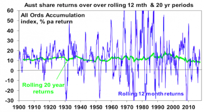
Investment markets bounce all over the place in the short term. As can be seen in the next chart even annual returns in the share market are highly volatile, but longer-term returns tend to be solid and relatively smooth. Since 1900 for Australian shares roughly two years out of ten have had negative returns but there are no negative returns over rolling 20-year periods. (It’s roughly three years out of ten for US shares since 1900.
Source: Global Financial Data, AMP Capital
Key message: the longer the time horizon, the greater the chance your investments will meet their goals. So in investing, time is on your side.
If you would like to discuss anything in this article, please call us on 07 5443 8312.
Important note: While every care has been taken in the preparation of this article, AMP Capital Investors Limited (ABN 59 001 777 591, AFSL 232497) and AMP Capital Funds Management Limited (ABN 15 159 557 721, AFSL 426455) makes no representations or warranties as to the accuracy or completeness of any statement in it including, without limitation, any forecasts. Past performance is not a reliable indicator of future performance. This article has been prepared for the purpose of providing general information, without taking account of any particular investor’s objectives, financial situation or needs. An investor should, before making any investment decisions, consider the appropriateness of the information in this article, and seek professional advice, having regard to the investor’s objectives, financial situation and needs. This article is solely for the use of the party to whom it is provided.
